7 ways to avoid getting fired for your new logo
And the best ad of the year goes to...
Hello Gobbledeers,
How’s it going?
It just occurred to me as I was typing this that maybe I should be doing some sort of Thanksgiving marketing tie-in given the name of this newsletter and how it - wait for it - includes “gobble” which is (obviously) the sound that English speakers think that a turkey makes (tho the internet tells me that Germans believe turkeys say “gururu.” Obviously they are wrong.) Anyway, I’ll make myself a note for next year.
In other housekeeping news, I’ll be co-hosting* a Zoom session on Thursday, December 5th, at 1pm Eastern about doing a better job with content.**
(*I think it’s like a fireside-chat type thing, I’m not exactly co-hosting it. But I’ll be the one chat chat chatting away.)
(**That’s not what the session is called, but it is what it’s about)
The actual hosting is being done by the founders of Mavuus, which runs a community for CMO and CMO-types (CMOs who work at companies where they call that role “VP of Marketing.”). You can sign up for free here. And if you’ve ever wanted to ask me question (I cannot imagine why you would want to ask me a question), but didn’t want to click on the Calendly link I post here every week offering to chat, this event will be a good opportunity to do that.
Onward!
Everyone Will Hate Your New Logo…But Who Cares?
Let’s start today with a quick quiz, shall we?
Imagine, per usual, you have been hired as the new chief marketing officer at a company. Congratulations. You’ve earned it! This is different than saying, “you deserve it!” because I’m not really sure anyone* deserves the grief associated with that job.
(*Besides the obvious historical figures who are often evoked in situations like these, and who would, of course, deserve what’s coming to them.)
Where was I? Oh yes, congratulations!
So here’s the quiz:
Which one of these things will get you fired quickest and ruin your career the longest?
a) Firing all the people on your team over the age of 50.
b) Firing the current marketing agency and replacing the agency with your friend’s new agency (Blue Armadillo, because of course), then rolling out a new campaign designed to get the “younger, more desirable customer” instead of the stupid middle aged cheapskates who typically buy your product.
c) Standing up during an all-hands meeting and listing all of the minority groups that you, personally, hate, while also speaking in what you think is a “funny” accent.
d) Redesigning the logo.
Obviously the answer is ‘D’
(You can fire the old folks because you want a team that’s “closer to the consumer;” you’ll eventually get fired for hiring Blue Armadillo, but you’ll hire them again at the next job; your company recently fired the DEI team at your company while also saying they’re against “cancel culture,” so you’re good there. Changing the logo is inexcusable.)
You know who would agree with me on this? Literally anyone who has ever been involved with a logo redesign.
I’m, of course, bringing this up this week because, as every publication puts it, “the internet” reacted poorly to Jaguar’s logo redesign:
That’s the old logo on the left and (duh), the new logo on the right.
Maybe you like it, maybe you don’t. Also maybe you never really thought about the Jaguar logo, and maybe if, prior to the new logo being rolled out, I had asked you to draw me the Jaguar logo, there is a zero percent chance you could’ve done that.
Companies do not undertake logo redesigns because their logo looks modern and new and reflective of the brand. Rather, quite the opposite (duh again). Also, people on “the internet” will complain about literally anything. To wit, here is a 1-star review of the STATUE OF LIBERTY:
(I wish those French people never burdened us with that pile of garbage.)
If you touch the logo, some people will write on the internet that they hate the new logo, then media outlets (ie, Substacks like this one) will write stories saying that “people are saying they hate the logo,” and then there will be multiple articles about how everyone hates the logo, then the Wall Street Journal will write an article about how everyone hates the logo, then it’s just a statement of fact that the logo you and your team created is terrible.
But we here at Gobbledy do not like to just complain, we like to provide solutions (and also to complain), and I thought it would be helpful to dig into a handful of logo changes to see what we can learn, and whether there is any way to change your company’s logo without losing your career.
GAP
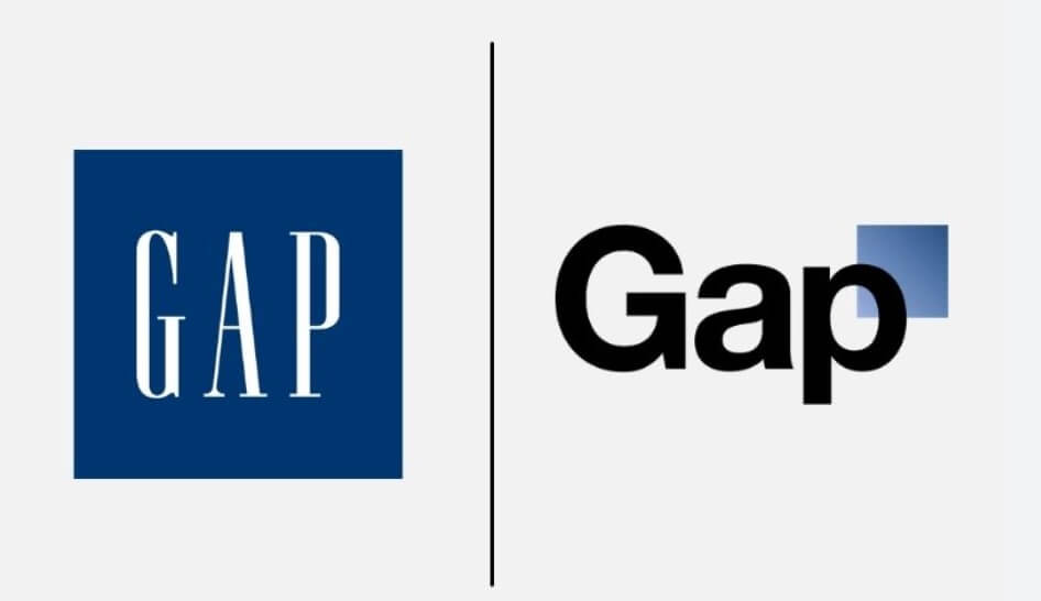
In 2010, after the company had been struggling for a number of years because nobody knew what the hell Gap stood for, they decided they could change the perception of their brand by changing their logo. Here’s what they did:
The really crazy part of the story that everyone at this point has forgotten about is that they threw out the logo after 6 days. 6 days! If you’re going to throw marketing under the bus, I would’ve thought it would take at least 6 days to acquire a bus and a licensed driver. Alas, no.
QANTAS & American Airlines
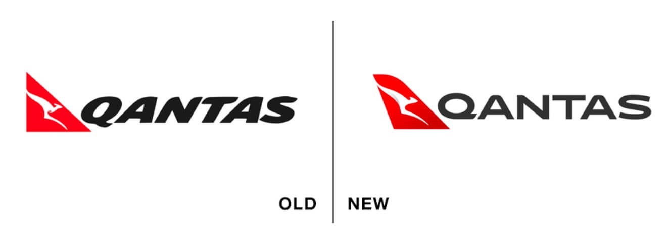
Here are two updates from airlines that I’ll discuss in a moment:
Google & Mozilla
Final two examples before getting to the takeaways:
OK, so what can we learn from this little exercise? I’m very, very, very, very, very much not a designer. But I am someone who has lost his job in the past, so I’m very, very, very, very much interested in helping people not lose their jobs.
If you’re going to undertake a logo redesign, there are a handful of things to note:
Make sure your spouse has health insurance, since COBRA is very expensive after they fire you.
If you have to change a logo, you can go from a serif font to a non-serif font to make it look “modern” even though I can’t tell you why it looks more modern.
If you have to change a logo, you can go from a non-serif font to a serif font, to make it look more serious and kinda enterprise-y (if that’s your new market).
If your font is in italics, you can remove the italics.
If you only have words in your logo, you can add a new element if you’d like (as Gap did), but the risk is likely greater than the reward.
If you have a non-word element in your font (like the QANTAS kangaroo, American Airlines eagle - or Jaguar’s jaguar), there is probably too much risk for you in removing it. If you hate it, it’s best to re-think it (as American did, with its newly stylized eagle) rather than to get rid of it (as Jaguar did), because even though you thought nobody gave a crap about Jaguar’s jaguar, someone on Twitter does care about it and, 4 steps later, there’s a Wall Street Journal article about how you removed the beloved mascot.
If you have to change the logo, and your spouse doesn’t have health insurance, then I think this Mailchimp example is your best bet - keep what you got, but make the weight of the font lighter:
(Thanks to Design Rush for the help…)
Enron’s Back!
That video is worth a look, if only because your company has definitely made a video like that.
Also, the new Enron’s website is pretty amazing, also because your company’s website has a website like that. “The world’s leading company” and “Growth comes from the lessons we learn, integrity guides our actions, and the energy of tomorrow fuels our drive. Our history may have shaped us, but it will not define who we become.”
Also, it’s a parody, which is clearly spelled out buried deep in the terms of use. But also also it’s not a parody because it sounds like every website. Also also also, I’m a little worried this is either a crypto something something. Which, when I think of it - isn’t crypto the same as Enron? Seems sorta like an actual thing, until it isn’t? Unless it was an actual thing with just a couple of bad apples? Dunno. But I do know that whoever made that website did a bang-up job of writing gobbledy. 4 stars.
Year End Best Ad of the Year, Year-End Edition
We are at the time of year when those of us who make content get very lazy and decide to make “year-end best of” lists. But I’m too lazy for that, so I will make a list of 1 thing, and that thing is the best ad of the year.
If you haven’t seen Wes Anderson’s 3-minute advertisement for Montblanc pens, you should. And I will make it easy by linking it here:
If you like Wes Anderson, you will like that ad. If you do not like Wes Anderson, you will hate it for all the reasons you hate Wes Anderson.
And while I’m guessing that your company will not hire Wes Anderson to create marketing materials for you, I’m really sharing that because it shows that there is a staid, Swiss, 100 year old+ company that is not afraid to have a point of view and a voice.
We talk a lot here about the Chief Marketing Officer role, and the struggles of being in that role. And I think that a lot of those struggles come down to - does what the CMO thinks she is supposed to be doing align with what the CEO thinks she should be doing.
In software, the CEO seems to think that the CMO should be generating leads. And that’s certainly true. But the CMO likely has a head of Demand Gen who is actually in charge of that part of the marketing.
The CMO really should be there to ensure that the brand has a voice and a point of view. That’s her job.
Montblanc, incredibly, for an old Swiss-owned company, was unafraid to have a voice and a point of view. And you, who works for a modern tech-forward business, DEFINITELY should not be afraid to give your brand a voice and a point of view. If I were in your shoes, during the Christmas (er, holiday) party I would sidle up to the CEO and ask if you can share your vision for your brand’s voice. What’s the worst that can happen*?
(*rhetorical question)
As always, thanks for reading to the end. As I mention each week, I get so much out of chatting with readers about marketing stuff. If you’d like to spend 25 minutes talking about marketing or new logo design, here’s my Calendly link. And for those of you new here, I help marketers create better messaging - shoot me an email or schedule time through that link so we can talk about how our 2-day workshop will transform how you talk about your company.


Speaking of people giving online reviews:
https://youtu.be/urVH0UUozz0?si=VcEPawjyFaNNUxCY
Well done for providing the Wes Anderson ad, while also making me feel bad that I did not know about the Wes Anderson ad. Plus, kudos to Montblanc for not changing their logo!