A great example of a marketing landing page + drugged desserts
Plus, apologies all around and chaos packaging
Hello Gobbledeers,
How’s it going? It seems hard to believe after 4 straight years of campaigning, when I send this newsletter next week we will, uh, probably not know who is president. Awesome.
This week:
Yet yet yet another apology.
Chaos packaging.
My own preemptive apology for a joke about packaging.
A great example of a competitor comparison page.
And if you want help with your messaging, a friendly reminder that that’s what I do for a living. Our 2-day messaging workshop will get your homepage sounding good as new. Unless your positioning is “we’re the old product in the market” in which case it will sound good as old. I’m at jared@sagelett.com.
Knot Funny, We’re Sorry
You think I WANT to write about marketing apologies every week? You think I wake up every day with my fingers crossed, just wishin' and hopin' and thinkin' and prayin' and plannin' and dreamin'* each night that a company will do something edgy to generate some buzz, then get some buzz, then apologize for doing exactly what they set out to do in the first place?
(*sorry Dusty)
Well, yeah actually I sorta do.
But it’s been every week lately, and part of me didn’t want to tell you about the restaurant that created a dessert with powdered sugar, then named it after disgraced, one-time cocaine addled - and then once again somewhat beloved - former mayor of Washington, DC, Marion Barry.
[For you young’uns: Barry was the mayor of DC and then busted in a sting operation in 1990 where an informant told Barry (who was being watched by FBI agents in the next hotel room) that he had to smoke crack before she would sleep with him (?). He then obliged her request, the FBI and DC Cops come into the room, and he’s caught on video saying, “bitch set me up,” which is not something you expect to come out of the mouth of a politician (that’s sarcasm).]
Moving along…
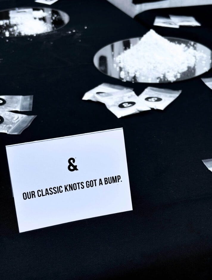
A DC pizzeria called &Pizza created a garlic knot-like dessert (minus the garlic), that has a berry filling, then advertised them with photographs of the knots next to piles of powdered sugar. Then they wrote copy that includes cocaine references, and puts out a release noting that this will push some buttons (“cross the lines of having too much fun.” Lines. Get it?)
Also, here is a photo from the press event where they launched the knots:
Well then of course, at this point you know the drill:
A group of people get upset.
It’s worth noting that a DC Councilwoman puts out a press release saying that the marketing is “tone deaf and hella disrespectful.” “Hella disrespectful” is amazing.
The CEO of the restaurant - the same CEO quoted as saying that they were creating a some boundary-pushing messaging around this product - then apologizes for pushing the boundary on the messaging: “While humor was our intent, it was regrettably off the mark…The parody of the former Mayor and portrayal of substance abuse was wrong. We have read the countless messages and social media posts and understand the frustration this has brought forth — especially to the Barry family.”
I have to write about this nonsense.
Live by the pile of powdered sugar, die by the pile of powdered sugar.
Chaos Packaging
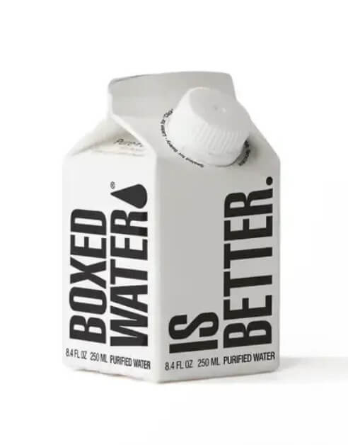
I am fascinated by products that are sold in an unexpected container. For example:
A Wall Street Journal article about this strategy quotes a marketing guy who calls this “chaos packaging,” a term that I like.
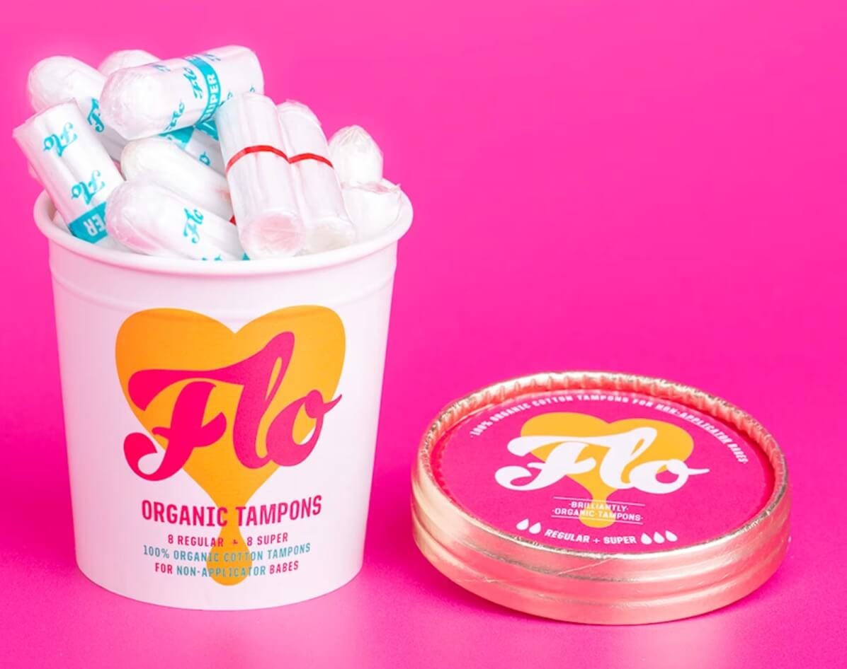
The article presents a bunch of examples: sunscreen sold in a whipped cream-type canister; gin sold in a container that looks like a motor oil can; tampons sold in an ice cream container:
(OK - I have literally been sitting here for an hour debating whether to include this or not, which usually means I should not include it, but I’m going to anyway):
They should’ve named the “ice cream” flavor on the canister “Sundae Bloody Sundae.”
(“While humor was our intent, it was regrettably off the mark…we will try to do better in the future.”)
Where was I?
Oh yes, chaos packaging.
I was bringing this up because I love the idea of using packaging like this as a way to market a virtual product (like software). A while back we talked here about the first Progressive Insurance ads featuring Flo, where they were set in a store and the insurance product was represented as boxes on shelves. The concept was to de-mystify shopping for insurance by suggesting it was as easy as buying a box of cereal.
So here’s a free idea (you get what you pay for, btw): I thought that this could be a fun way to make your SaaS product more memorable if you have booths at trade shows. Rather than giving away stupid tchotchkes or stuffed animals, create packaging for your product - like a shaving cream can, or a detergent bottle, or a carton of milk, or a tube or whatever…
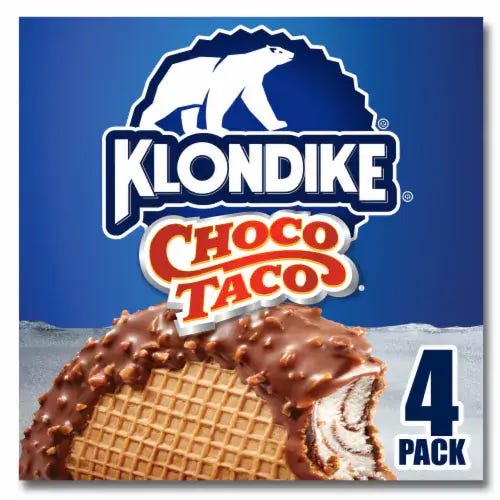
People like things that include an element of a second thing. A taco is good, but a taco that’s ice cream is amazing:
What I’m saying is - your AI merchandising tool can be the Choco Taco of the next Shoptalk conference.
What If You Just Told Prospects Why You’re Better Than Competitors?
One of the mysteries of software marketing is why companies don’t do a better job of using marketing to differentiate themselves from competitors.
Generally the task of explaining how you’re different from the competition falls squarely in the laps of the sales team. This, I guess, can be fine, but not as fine as, I dunno, just writing on your website why you’re a better choice than your competitors.
I talk quite a bit here about just going back to the basics with marketing, and the most basic of the basics is that when you’re thinking about what should go on the website, it helps to think about the purchase cycle in terms of Awareness, Consideration and Purchase.
Awareness is usually done elsewhere - conferences, other events, outreach by Sales Development Reps, uh, direct mail? The Purchase decision is usually facilitated by the sales team (what can I do to get you into a new AI Chatbot today?). Which leaves Consideration as the primary reason your website exists.
And if you just strip it down to that - how do I use the real estate on my website to ensure that my prospect is seriously considering buying my product - it makes it, well- I guess “easier” isn’t exactly right - but maybe less difficult if everyone in the company shares the same reason that they think the website exists.
If you get everyone from the marketing team in a room and say, “Let’s just list out all the reasons someone should consider buying us” I will hope that someone on your team will respond with, “Who is the ‘someone’ you are referring to?”
And that is a good question. But let’s put it aside for a moment, just to make this easier.
So you can list out all the reasons someone should consider buying you. And I am 100% certain that one of the reasons - besides that buying you will not get them fired - is that it’s better than the other options.
But very, very few websites actually do this. Mostly they tell you why their category is important (HR software makes payroll fun!), coupled with benefits that apply to every company in the category (your employees will be happier!).
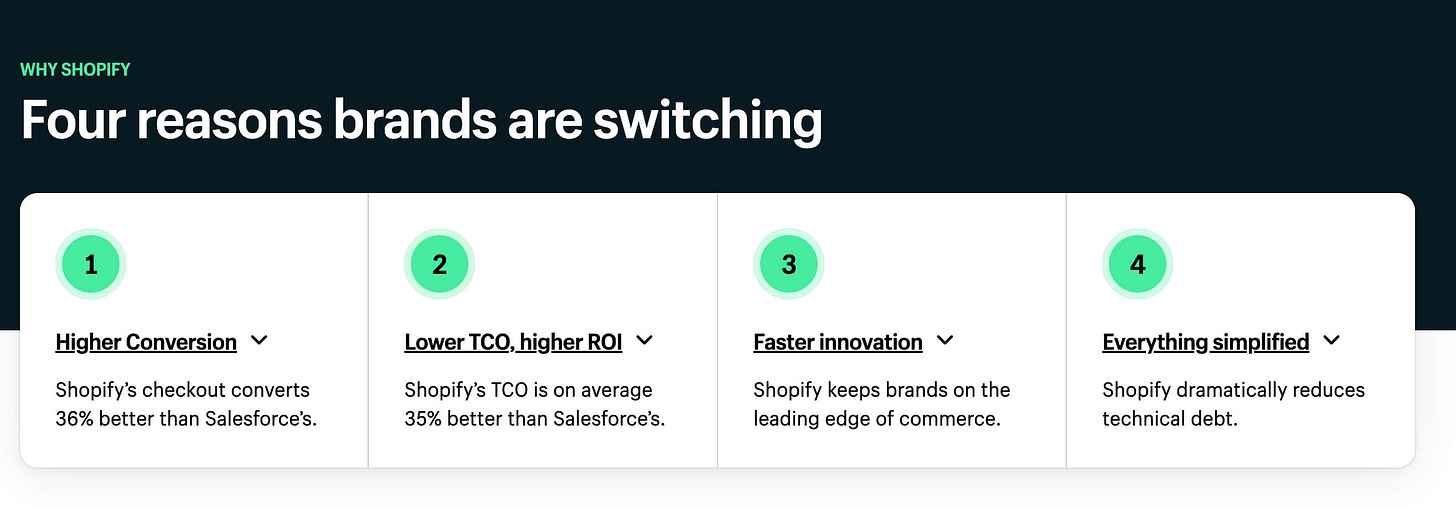
Which is why I was so impressed with this Shopify page talking about how they compare to Salesforce Commerce Cloud. Incredibly, it’s actually focused on consideration, and what people consider when making this purchase:
Weird - it seems almost TOO simple…Shopify thinks people choose them for 4 reasons, so they put on their site that there are 4 reasons people choose them. And then, in a crazy twist, they list the 4 reasons. And provide considerable additional detail for people who want to dig in a little more to those 4 things.
Sometimes marketing is kinda obvious - if you want someone to consider you, you should think about why they should consider you, then you should tell them there are X number of reasons why people buy you over the competition, then you provide detail around that.
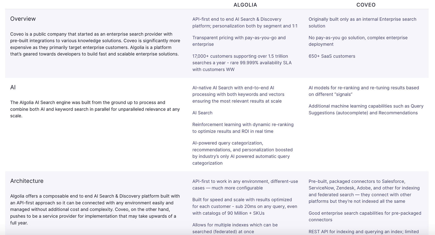
Except if it WERE that simple, you wouldn’t end up with whatever this page is from search company Algolia, where they are helping people who are considering Algolia understand why people buy them over competitor Coveo:
Even putting aside the actual content (OK, I’m not sure I can put aside the actual content: “Coveo is significantly more expensive as they primarily target enterprise customers. Algolia is a platform that’s geared towards developers to build fast and scalable enterprise solutions.” Soooooo, Coveo is for enterprise customers, so it’s expensive, whereas Algolia is for enterprise solutions which obviously makes it not expensive?)…where was I? Oh yes, putting aside the actual content, nobody is going to read all that, because it’s not structured in a way to make it obvious what are the key points.
Think about that difference: Shopify says there are 4 reasons why people choose them, then list the reasons. Algolia presents a list of topics, then makes you read through them and draw your own conclusions. It’s not like it’s wrong, but it doesn’t help anyone consider why they should buy you.
This presents a fun (“fun”) exercise for your team: What are the 4 reasons someone should choose you and not your competition? I promise that if you get a marketer, and engineer, a product person, a rabbi and a priest (you don’t need 2 of those
people) in a room, you will hear very different reasons about why someone should buy your product. And if that sounds confusing to you while you’re sitting in the room, imagine how it feels to someone who on the receiving end of that information who has not been spending the last two years thinking about the product.
As always, thanks for reading to the end. Like I mention each week, I get so much out of chatting with readers about marketing stuff. If you’d like to spend 25 minutes in marketing therapy (or whatever), here’s my Calendly link. It always feels like begging when newsletter writers write, “share what kinda chaos packaging you like in the comments!” so I won’t write that, but you can feel free to write in the comments. I respond to all of them…


Thanks for the wild reminder that &pizza exists. I LOLed...and I may need to eat it sometime soon!