


[New] Homepage Messaging Teardown, with 9 Takeaways
We're trying something new...and I think you'll find it useful

Hello Gobbledeers,
How’s it going?
Yeah, that’s right you’re hearing from me on a Monday.
In my attempt to provide some actual useful messaging ideas that you can put into practice on your own sites, I’m going to periodically send a Monday Breakdown - a deep dive into one company’s homepage, section by section.
Despite what I said last week (never trust anyone!) I’m going to put some of this breakdown behind a paywall - I really appreciate everyone who has subscribed since I introduced that option last week. And I’m going to keep the Wednesday Gobbledy newsletter and Everything Is Marketing podcast open to free subscribers. But if you want the full homepage messaging deep dive, it’ll be subscriber only.
If you’d like me to do a deep dive on your own company’s homepage, that would be wonderful! For both of us! You’ll see in the subscription sign up that “Platinum Gobbledeer” is one of the options - as a special bonus, that includes a homepage messaging deep dive (a block-by-block breakdown of your homepage, like you see below), and a Zoom call where we’ll walk through the results together. It’s a steal, I promise. At the end, you’ll have a roadmap for how to make your homepage wayyyy more clear for your prospects. Who wouldn’t want that?
Any questions? I’m at jared@sagelett.com.
See you on Wednesday…Thanks for letting me try new stuff :)
Monday Breakdown: Chainguard
Chainguard is a, uh, it’s a, um, hm. It’s a technical product of some sort. I’ll assume here that what this product does is not something I’d understand. That’s totally fine.
Let’s break down each section of the website, and take a look at the messaging, and what they’ve done well, and what could be improved…
Block 1: “The Safe Source for Open Source”
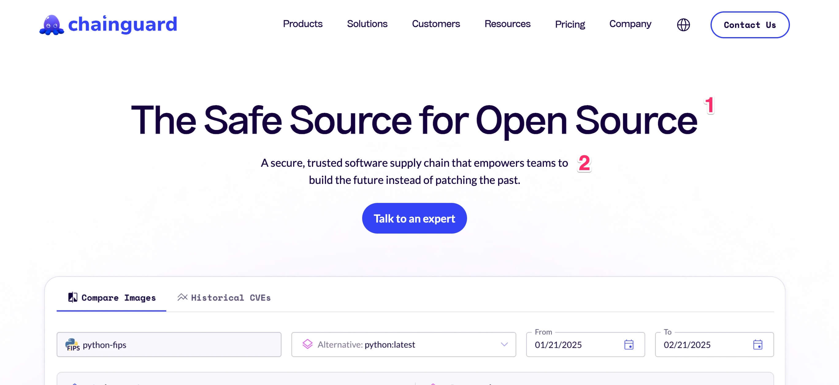
I’ve said here before that the best marketing is where your target market 100% understands it and your non-target market does not. So that’s fine. Even so, I think they should be using either Spot 1 or Spot 2 to be clearer about what Chainguard is.
I think it’s OK to go with a cutesy/clever headline like this one. Collectively we’ve all kind of decided that a website headline is like an advertisement headline - that it can be cute or clever, but I don’t think this is actually the best use of this space. The headline should tell you what this is and who would want it; or at a minimum, what it is and why’s it’s better than alternative.
In this case, they could bring in language from Spot 2 and go with something like, “The Most Secure Software Supply Chain” (again, I’m not even 100% sure what this thing is…) I just suggest that the top headline be clear about the differentiator, clear about who it’s for, or - preferably - both.
Block 2: “A secure, trusted software supply chain that empowers teams to build the future instead of patching the past.”
I have two issues with the subhead:
First, I’d suggest using the subhead to clarify the heading. If you didn’t include who the product is for in the heading, then use this area to clarify that. Instead of using “teams” say specifically what kind of teams - is it really for EVERY type of engineering team? There’s got to be some way to clarify the target market, and to add in WHAT the benefit is. I get that they’ve gone cute here with “build the future instead of patching the past.” But there’s got to be a clearer way to say what the product is doing - I’m sure there are tons of products that will say it’ll help streamline writing code. But there’s got to be something more specific to include here.
Secondly, In Gobbledy’s seminal piece “15 Words Not to Use On Your Website” word number 2 was “empower.” Here’s what I wrote at the time:
One of those words where if you stare at it long enough you start to think, “how are the letters ‘m-p-o-w” in a row? That looks so weird. Um-poh. Um-poh. That can’t be right.” But oh, it’s right. So then how can something so right be so wrong? Like ‘leverage’, if you’re using it you’re making yourself the star of the show. e.g. “Conblabbify empowers marketers to create experiences that blah blah blah.”
What to use instead: I’d suggest “Customers spend 82% more when they come across Conblabbify recommendations.”
Similarly here, don’t talk about how Chainguard empowers you, talk about the benefits you get (12 fewer hours doing XXX or whatever) when you use it. All software empowers you to do something. Don’t waste the space.
Block 3: Image of the product
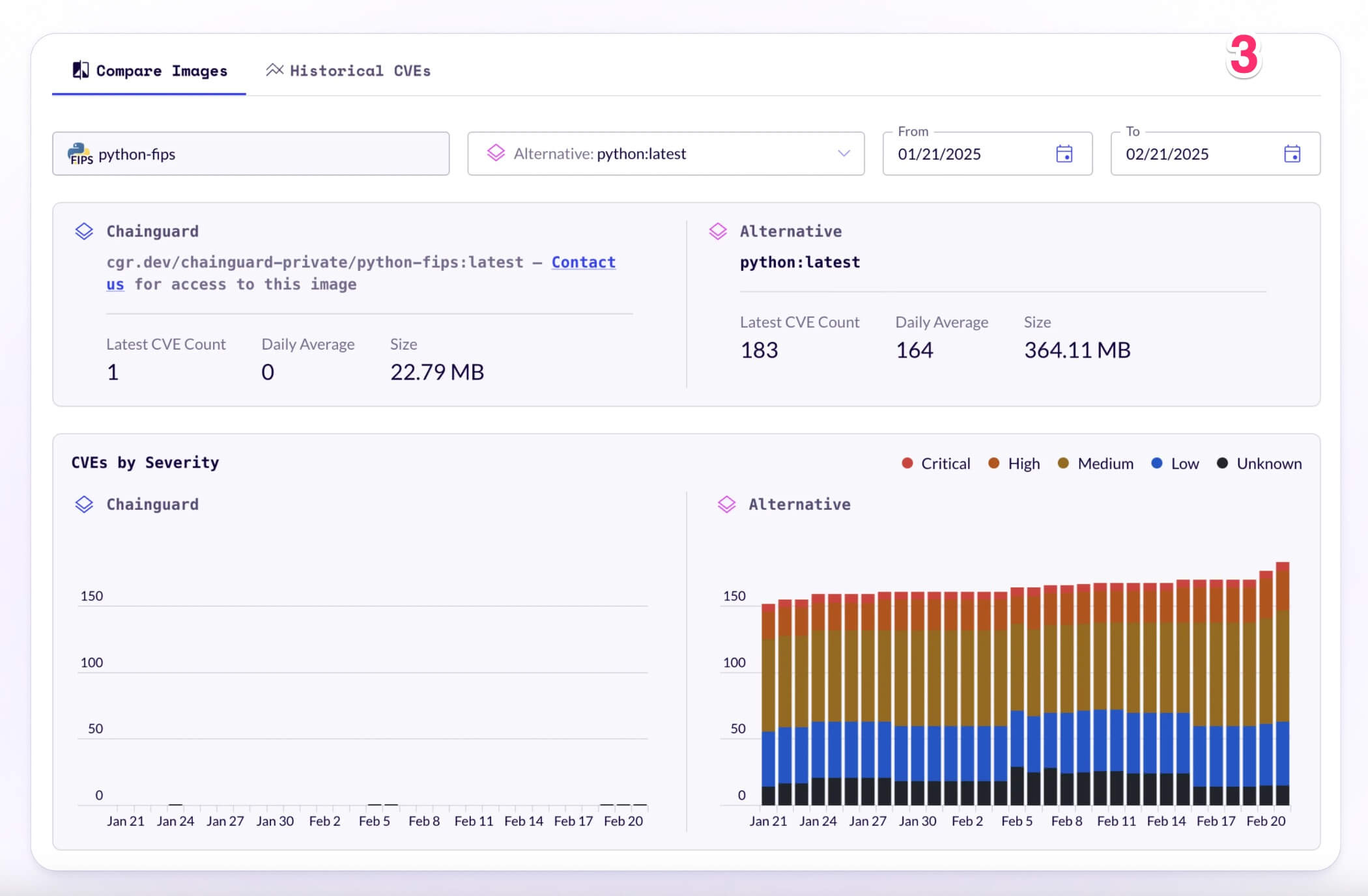
Often companies will use a stylized version of the product to give you the vague notion that it is, in fact, a software product. I really like here that they’re giving you enough of a sense of the product that you know a bit about what this provides and that it’s definitely a product for developers.
My only recommendation would be that this links off to a video to see the product in action. I don’t know jack squat about what this does, and even I was thinking to myself, “hm, I’m curious what I can do with that.”
Block 4: “The world’s leading companies trust Chainguard”
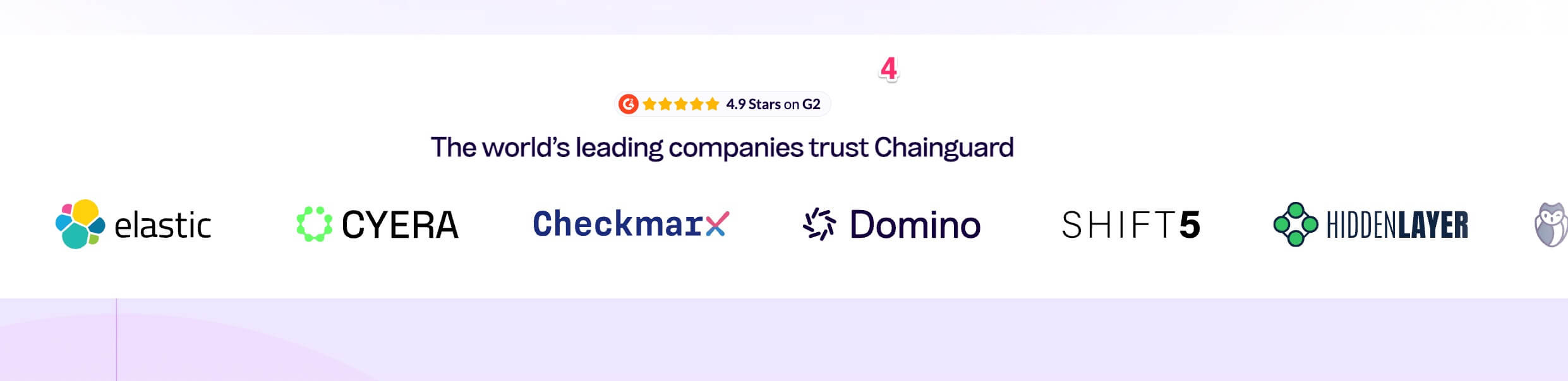
First, good for them for having 4.9 stars on G2. Boo to them for hiding that piece of information down the page and in a tiny font.
Basecamp used to display their ratings in the best way - just under their logo on the top left of the page:
They’ve removed that for some reason, and whatever that reason is, I don’t like it. People want social proof, and the more you can put it at the top of the page (and you can have it at the top AND in the middle of the page, because that’s how much it matters) the better it is.
The copy on top of the logo block is an opportunity to reinforce who the product is for - remember, when someone comes to the website, they are trying to figure out if it is the right product for THEM. The more you can say who benefits from using the product, the more comfortable the visitor will feel.
In this case, they went with “The world’s leading companies trust Chainguard” - I won’t bore you with screenshots of it here, but there are approximately an infinite number of companies that use the “The world’s leading companies trust XXX” construction on their logo block. That provides no information to the reader. “Companies that want to streamline open source delivery choose Chainguard” (or, y’know, whatever) tells you more about the product. Don’t waste the space.
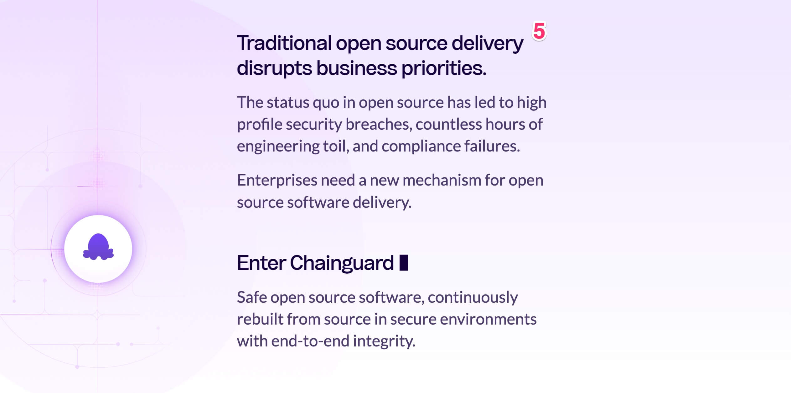
Block 5: “Traditional open source delivery disrupts business priorities”
Want to continue reading the Monday Breakdown? Subscribe to Gobbledy…
Keep reading with a 7-day free trial
Subscribe to Gobbledy to keep reading this post and get 7 days of free access to the full post archives.