No really, this is the best website copy...and - spoiler - there's no copy
Plus a dive into the limerick on Sprinklr's homepage
Hello Gobbledeers,
How’s it going? Based on what I’m seeing on LinkedIn, everyone in marketing is now “looking forward to the next stage in their career journey.” I hope you’re not currently in the process of looking forward to the next stage in your career journey.
Please Sound Out the Name of Your Company
Here’s some free advice:
If you’re going to use “AI” in your name, please sound out the name and make sure it won’t make a 12 year old boy laugh or sound like a character in a James Bond film. For example:
(Both thank you - and apologies to - Gobbledy reader Lynna for passing that along…)
I Lied about the Other Websites I’ve Previously Called “the Best Website”
I’m aware that a few times in the past here I’ve said that some software website was the best software website. And I’m sure* I wasn’t lying to you when I wrote that.
(*fairly sure)
A lot of the work I do is about making sure your marketing copy isn’t gobbledy, and given how much gobbledy I still see on websites, obviously I’ve failed. Miserably. I’ve failed miserably.
But what if it turns out I’m approaching this whole thing completely wrong? What if the problem isn’t that your messaging is incomprehensible. What if the problem is that there’s messaging at all?
What if the best website has virtually no copy at all?
Allow me to introduce you to my new favorite website, Rows.com.
Rows.com is the Teller to every other website’s Penn. Sometimes silence is the most magical (I’m embarrassed how long it took me to come up with that, and I know it’s terrible. My most insincere apologies.)
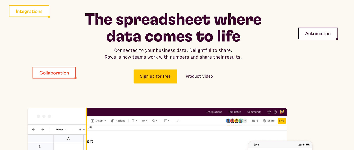
Rows is some sort of advanced spreadsheet tool. Here’s what their website used to look like:
Kind of the usual whatever. It’s “delightful to share,” which is definitely not true. But it’s a website, and if you’ve heard of Rows you’ve probably come to the website to get a glimpse at how it works and how it’s different from Airtable or Excel or some other spreadsheety tool.
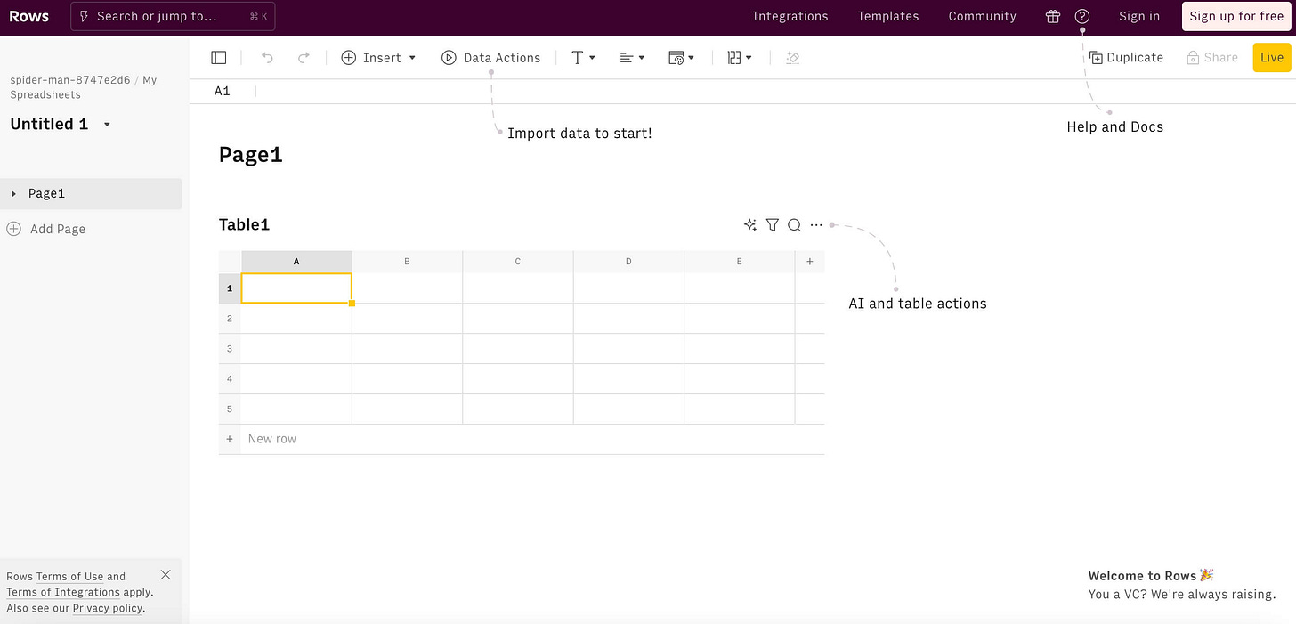
So they did something which seems super obvious - they replaced the website with the tool:
That’s the website. The spreadsheet works. They added a couple of pointers (Help and Docs, etc) but otherwise, it’s the tool.
If you’re selling a freemium product, this is either the most brilliant approach I’ve ever seen, or it’s the stupidest I’ve ever seen. I’m like 97% sure it’s the most brilliant (and I used Rows.com to figure out, then, that there’s a 3% chance I think it’s the stupidest I’ve ever seen. Thanks, Rows.com!)
Why do you need the usual blah blah blah where I have to click something to watch a demo video or read gobbledy telling me why it’s the best spreadsheet for numerically obsessed computators (or whatever)?
Answer? YOU DON’T!
You can just put the tool right in there.
I’m sure we can all come up with 100 reasons why this is a terrible idea. But that’s true about any real innovation. Things exist for a reason, and new things tend to seem stupid compared to existing things.
But today I will declare Rows.com as having the best website I’ve ever seen. Mazel Tov.
(Thanks to Harry Dry, who writes the Marketing Examples newsletter, which you should subscribe to.)
5 Takeaways from a Homepage - And a Hidden Limerick
It’s been a while since we dug into a homepage and talked about what it’s trying to achieve, so I thought today we’d jump into “Unified-CXM” (???) platform Sprinklr.
Sprinklr was a social media management tool that became what they’re calling a “Unified-CXM” tool, which probably means something, but sounds like they’re trying a little too hard to make “fetch” happen. In fairness to them, if you click into their site, you find out that it stands for “Unified Customer Experience Management.”
You are free to wonder why it’s hyphenated as “Unified-CXM” when there’s no hyphen in “Unified Customer Experience Management.”
While you’re wondering that, here are 5 takeaways from their homepage:
Takeaway 1: Your Founder Should Always Be Positive
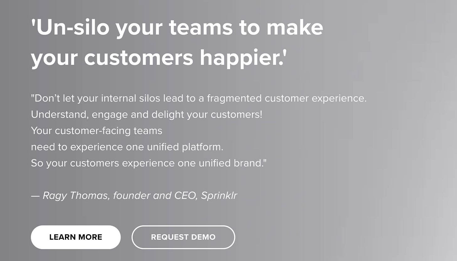
Let’s take a look at the site. Here’s the top section:
First…is that a limerick? I’m serious. Is that a limerick on their website?
Don’t let your internal silos lead to a fragmented customer experience (in Nantucket)
Understand, engage and delight your customers!
Your customer-facing teams
Need to experience on unifed platform.
So you customers experience on unified brand.
Holy crap, it’s a limerick. A terrible, terrible limerick. Wow.
My apologies for the distraction…
I actually can’t think of another time I’ve seen a quote from a founder as the copy at the top of the website (I cut it off in that picture, but there’s a video on the right side of the page as well). I think it can be incredibly effective - who knows how to explain what the thing does better than the founder?
Except this doesn’t really do that. Put aside why his quote is in single quotation marks (details matter!) - I’m not following the logic. “Un-silo your teams” doesn’t really mean anything, and I don’t get how that’s tied to the software. Teams are siloed because of organizational design, no? Does the software un-silo my teams? Is that just a clunky way of saying that your teams now have access to the same data, even if they don’t report to the same person? (I think that’s what it’s saying, and if it’s saying that, why doesn’t it actually say that?)
And why is there an exclamation point after “Understand, engage and delight your customers!” Why the hell are you yelling at me? I didn’t silo the teams!
Then the logic of “Your customer-facing teams need to experience one unified platform. So your customers experience one unified brand” is wonky. Why do my customers care whether my teams experience a certain type of platform?
I’d also suggest that any quote from a founder like this should be positive. It shouldn’t be a “don’t let” or “don’t do” — it should be actively positive. “We built the blah blah blah platform so customers can experience the brand in the same way, at every touchpoint.” (Or whatever.) In marketing, the founder should always be speaking positively (“now you can” rather than “you shouldn’t…”)
Takeaway 2: Make Sure Your Numbers in Your Marketing Are Consistent
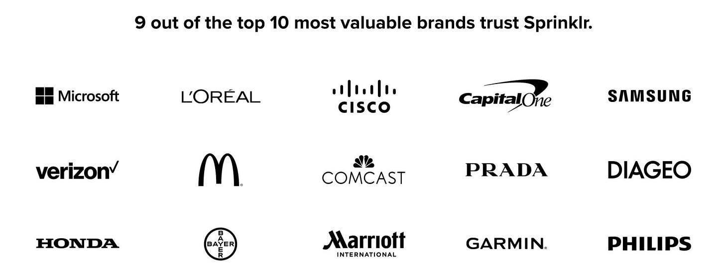
The headline is great and shows that this is a platform for enterprises. But if it’s 9 out of 10 brands trusting Sprinklr, why are there 15 brands?
Takeaway 3: Don’t Just Include Copy to Fill Out the Page
I’ve yet to mention that Sprinklr has been incredibly successful - they went public a few years ago, and they’re definitely a leader in whatever space Unified-CXM is. Which is why they deserve better than to have an extra space between “insights” and “into” in that headline.
(Yes, that’s nit-picky. But giving a crap about proofreading shows that you give a crap about your product. They’re not separate things.)
Also, don’t just use the subhead to repeat what you wrote in the headline. The headline says they “transform customer data into insights.” Then the subhead says they turn “customer data into actionable insights.” If the subhead is just going to repeat the headline, leave the subhead out.
Takeaway 4: Avoid Plural Product Names
When you’re naming a product, keep in mind how it’ll be used in marketing. "Sprinklr Insights” is fine, except that it’s used with a singular verb, which leads to the somewhat awkward “Sprinklr Insights is.” I’d just avoid using plurals in your name. You’ll thank me later.*
(* No you won’t.)
Note how the rest of their product names are singular, which will help avoid some awkward sentence construction in the future:
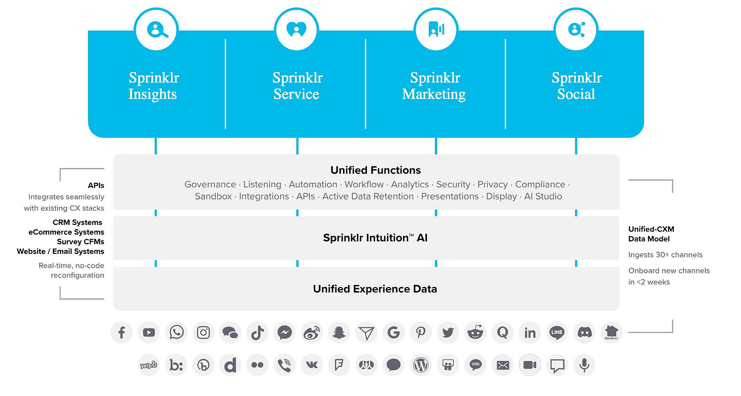
Bonus takeaway: that graphic is a mess.
Takeaway 5: If You’re Going to Create a Category, Describe It Concisely
That graphic is also there to explain what Unified-CXM is. That’s a lot of stuff.
Maybe I’m losing my mind, but I think it would behoove them to explain Unified-CXM at the top of the page. And to explain it concisely - “4 Powerful Customer Experience Management Tools, 1 Platform to Make Those Customers Happier.” Or something.
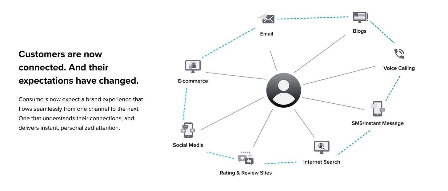
They do have a page dedicated to trying to explain what Unified-CXM is, but it’s gobbledy mix of meaningless terms they’re trying to brand (“the unifiers (tm)” and “Human@Scale, (tm)”) as well as this graphic:
I really only mentioned that because I like that they haven’t updated it since they put “Blogs” in there.
So let’s see - overall I’d give Sprinklr a 78 out of 100. I’ve seen much worse! And they get 12 extra points for sneaking a limerick in there, and they lose 24 points for that graphic that includes “Blogs” and an American flag. Because most blogs are about America.
How We Can Work Together
I’m happy to chat - here’s my Calendly link. I’ve had a few great calls lately where we did just what I did above - dig through your homepage and talk about what could be clearer.
Oh - and I think I’m going to do more of those here. It’s fun to dig into a site.
And it would mean the world if you could share Gobbledy with 2 friends.



It's more like nerd Haiku.
I visited the Rows website, but even with clicking around was not able to find what made the software better than or even different to Google Sheets or Excel. Like, I was willing for them to tell me, I wanted to know. But I couldn't find anything, and it just looks like standard spreadsheet software to me, so I am not motivated to try it.