The end of content marketing [in the airline industry]
And also a toilet paper number problem
Hello Gobbledeers,
How’s it going? I’ve been swamped with working someone is actually paying me to do (woo hoo!), so let’s just jump into this (also, this is normally where I would remind readers that I work with software companies to improve their messaging, typically with a fun (“fun”) 2-day workshop that will transform how you talk about your product. I’m at jared@sagelett.com if you’d like to chat.
Onward!
The Math of Toilet Paper Marketing
One of the things we’ve talked about here since the beginning of Gobbledy is the use of numbers in marketing, and how repeating numbers in your messaging can be a good thing. Think of Ivory Soap being 99 44/100% pure, or 4 out 5 dentists surveyed preferring sugarless gum like Trident, or 15 minutes can save you 15% with Geico.
The lesson is that repetition matters more than the numbers, themselves. Ivory could’ve reduced that fraction to 11/25ths. Or it could’ve left you wondering why you would want a soap that’s 56/100ths percent impure (sort of a Madonna-Whore complex, but for soap). Every hack comedian has done a bit about the 5th dentist.
Geico actually found that it only took 8 minutes on the phone with them to get a quote, but when they focus-grouped a tagline that mentioned 8 minutes, people didn’t believe them. So they changed it to 15 minutes. Repeating the message matters more than the actual numbers and what they represent.
Software companies typically just throw a bunch of numbers on the website because someone said, “you need to have more metrics on the website.” I’m showing an example below from self-proclaimed “GTM AI Platform” copy.ai. (Oh, you’re wondering, “What’s a GTM AI Platform?” I’m glad you asked. Copy.ai, according to their website - and following the “Play Bigger” gobbledy-infused category creation playbook [PBGICCP] - says that a GTM AI Platform exists to “Infuse AI across your go-to-market engine with a single platform — not dozens of copilots and point solutions. Codify best practices, unify data, connect teams, and eliminate GTM bloat. Power all key GTM use cases and realize the full value of AI.” There ya go. You’re welcome, and I’m sorry.)
Anyway, this is how they present some numbers on their website:
Yeah, it’s $2.6m and $650m and also 650m (which may or may not be the same thing, but one has the $ and one doesn’t), and 100,000+ and 18% and 300%.
It hadn’t actually occurred to me until this week that maybe you, as the website visitor, aren’t supposed to actually bother to figure out what those numbers mean. That they exist to 1) show that the product does something measurable; and 2) make it almost impossible to compare how well this specific product works to how well a competitor product works.
That hadn’t occurred to me until I read about toilet paper.
Vox has a pretty detailed article about toilet paper, toilet paper packaging, and how you’re supposed to decide whether “10 Mega Rolls = 82 regular rolls” is a better deal than “14 Super Mega Rolls = 78 regular rolls” or whether you should buy the one that says “22 Family Mega Super Rolls = 92 regular Super Mega rolls” or whatever. (Just me or does “Super Mega 92” sound like a radio station in Miami?)
In other words, numbers are used in marketing specifically to CONFUSE rather than to represent the product’s attributes (soap purity, for example). From that Vox article:
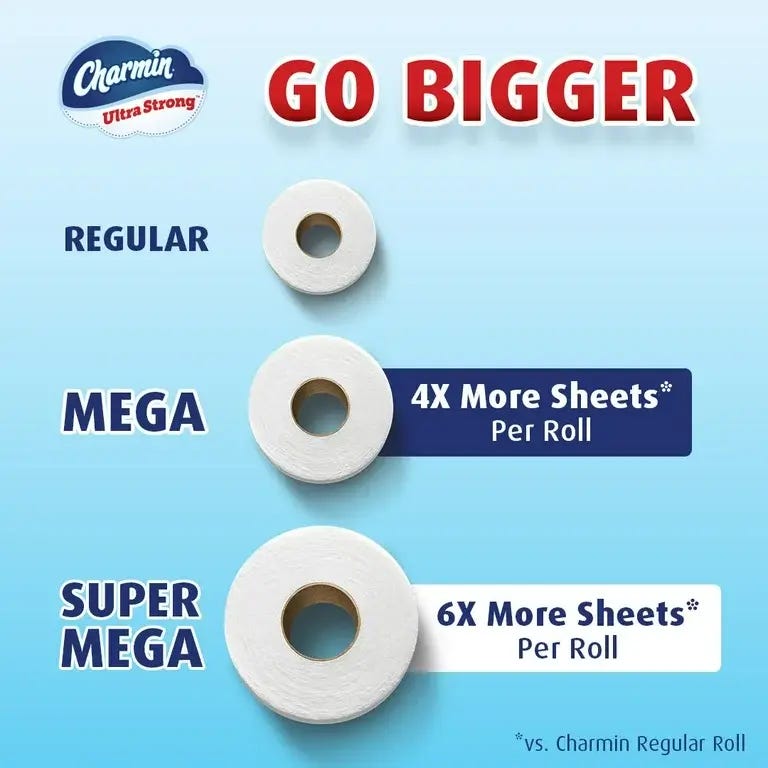
Unsurprisingly, the so-called standard size has no consistency, either. Charmin’s regular roll has 55 two-ply sheets, for example, but it’s often hard to even find the regular size of a brand’s toilet paper in stores. The mega roll is often advertised as having four times as many sheets as the mythical “regular” it’s being compared to, which means that Cottonelle’s idea of a regular roll contains 61 sheets, Quilted Northern’s an awkward 73.75 sheets, and Angel Soft’s 80 sheets. But even these are perplexing figures since many real-life standard toilet paper rolls contain more than 100 sheets.
I found that Charmin provided this very helpful conversion chart, because buying toilet paper definitely should involve math:
(And now I’m down the toilet/rabbit hole…did you know this existed:)
Charmin sells a roll of toilet paper that lasts for a month. A month! I have no idea how many Mega Family Super Rolls that equals. Or whether you need to tell them what type of food your family eats so they can adjust the size of a “one month” roll.
Sorry, I’ve gotten very sidetracked. The point I was making is that numbers can also be used as a way to actually get customers NOT to try to figure out whether your product works well compared to a competitor, or whether it’s a good value. That’s not a knock - it’s a totally reasonable strategy. If you don’t want to sell based on “we’re cheaper” or “we’re more effective by 12%” (assuming you’re actually more effective by 12%), then distraction-by-numbers is a smart strategy.
You know what else is a good strategy? Mascots!
That’s the Charmin bear, dispelling the old saw that a bear poops in the woods, when in fact they poop on a toilet in a bathroom while reading Bear Magazine. (Though when his wife’s not around he reads Bare Magazine. Wordplay!)
And for those of you who actually are trying to figure out if your toilet paper purchase is a good deal, someone built a calculator to calculate that for you.
United, a Rhapsody in Booooooo! (That’s “boo” you suck, not “boo” that’s scary)
I wanted to pour one out (as the kids say) for the end of an era in content marketing.
I am, of course, talking about the final issue of United Airlines’ in-flight Hemispheres Magazine, the last of the in-flight publications from major US airlines.
Long story short, in-flight magazines - most of which were produced by one company called Ink Global - were victims (in some part) of in-flight wifi, which allowed people to read whatever they wanted, rather than reading inoffensive celebrity and business stories. (As The Office’s Michael Scott once said about American Airlines’ magazine American Way: “They did this great profile last month of Doris Roberts and where she likes to eat when she’s in Phoenix. Illuminating.”)
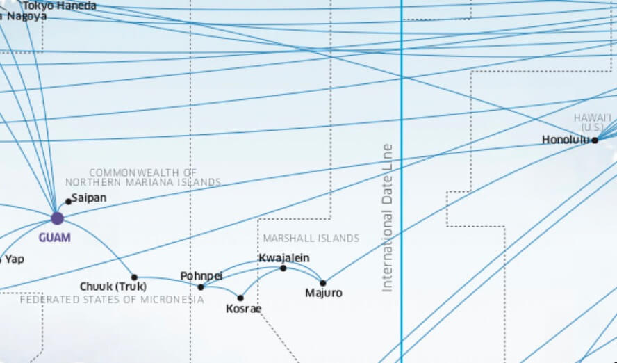
As someone who pulls out the in-flight magazine every time I fly so I can look at route maps, this is a disappointing development. All those tiny dots on the map became places I wanted to learn more about. And ultimately places I wanted to go (and spend money with that airline to fly there). Since I started flying Continental (now United), I would take out the route map and stare at this part of the map:
Specifically, the line from Honolulu to Majuro, Kwajalein, Kosrae, Pohnpei, Chuuk, to Guam. For airplane nerds out there, you may know that as the “Island Hopper,” a route that Continental Airlines launched in 1968 that hopscotched across the Marshall Islands and Federated States of Micronesia, before ending a very long day in Guam.
As a teenager I would go to the Morristown Public Library and skim through the Lonely Planet South Pacific & Micronesia to look at pictures of those dots, because how in the world could I ever even imagine what Pohnpei looked like?
Each time I’d open that route map, it tacitly offered me this marketing message: “Continental can take you to places you can only imagine.” That’s some powerful content marketing.
A few years back I took the island hopper. It was better than I imagined. And I had imagined it forever. I’m not really sure what I thought Pohnpei looked like, but it turns out it looks like this from the window of a 737:
The magazine is gone, but United is still thinking about the link between content marketing and the destinations it serves. It recently announced they’ll be flying to Nuuk, Greenland, and there was a lot of talk among the airline nerd world about why they were doing that. One of their execs said that they added the new destinations (which he called “unique content”) help drive lucrative credit card signups. Then he added, “The more unique content, the more we differentiate ourselves from our competitors and the more people are going to spend on United…” What an interesting idea that they view the destination as their content.
What can great content do? It can drive a guy like me to fly 11 hours to Honolulu, stay overnight, then get on a plane at 7am, and spend 14 hours on a plane skipping across the Pacific. And think it was an incredible experience that only United could’ve offered me.
The saddest part of this whole thing is that the in-flight magazine is being replaced by some sort of new digital experience, which is being described with an amazing amount of gobbledy:
Kinective Media will be “the first media network that uses insights from travel behaviors to connect customers to personalized, real-time advertising, content, experiences, and offers from leading brands.”
Ugh. Goodbye poor Hemispheres, we hardly knew ye.
As always, thanks for reading to the end. As I mention each week, I get so much out of chatting with readers about marketing stuff. If you’d like to spend 25 minutes talking about marketing or places you’ve flown because you saw them listed in an airline magazine, here’s my Calendly link. And for those of you new here, I help marketers create better messaging - shoot me an email or schedule time through that link so we can talk about how our 2-day workshop will transform how you talk about your company.






I'm reminded of when my young son, hearing one of those Geico ads, said he wanted to call them up and find out if 100 minutes could save him 100% on his car insurance!
When his wife isn't around, the Salvatore Romano bear reads Bare Bear Bear Magazine.