Hello Gobbledeers,
It turns out a bunch of folks also thought that software companies should eliminate the CMO role - last week’s column had the biggest response we’ve seen so far. Thank you to everyone who shared (even to those who disagreed with it), and welcome to all the new subscribers. Great to have you on the team.
Product Detail Pages
While reading this week’s edition of eCommerce Weekly, a newsletter put out by current Google marketing guy and former co-worker Ben Kruger, he includes some wise advice from another really smart person, Rishi Rawat, who calls himself The Shopify Product Page Guy (I think I’ve given everyone the credit they deserve, despite the clunkiness of those sentences). Rishi writes quite a bit about product detail pages - which is admittedly a more B2C marketing thing - but his ideas definitely hold true for software company landing pages.
Rishi makes the point that product detail pages (PDPs) are, for companies selling to consumers, the entirety of their website. Not the homepage + the PDP + category pages - the product detail page. Why? Because product searches generally land on a PDP, so that page basically has to do the work of the entire site - meaning, tell the story of why someone should buy the product from this company. He writes:
To achieve this goal our PDP must nail the opening.
Your opening has two jobs:
Job 1: Getting visitors to forget about those other open tabs. As long as they remain in view our sale is at risk.
Job 2: Introduce us, the brand. We have to sell the new visitor on us before pitching them our products.
He continues that the landing page must acknowledge that there are other competitors out there (so you don’t leave and start looking for other competitors) and immediately say why those other competitors are inferior.
This is great advice for those of us in softwareworld, and it’s advice that I see ignored ALL. THE. TIME.
Your website’s primary job isn’t to say that the thing you do is important - the person wouldn’t have landed on your page if they weren’t interested in learning more about how your solution solves their problem - it’s to say how it’s better than anything else out there for your target market. As Rishi notes, this is so when someone leaves your site and goes to the competition, they already have doubts that the competitor meets their needs (because you’ve put the doubt in their head).
In case you were wondering, almost no software companies do this. (I say “almost” but I’ve not actually seen anyone do this, which seems crazy.)
We’re Switching to Fluzzo.io
Today we’re going to take a look at HR software websites. It’s possible that every company I’ve ever worked at has used a different HR software solution. And it’s also possible that every company I’ve ever worked at has, while I was working there, switched HR software solutions**. This may be the Head of HR equivalent of how when you hire a new CMO, she’s going to fire the agencies you have and bring in her own agencies, which will be a great solution for the 19 months that she’s working there, until she’s let go and the PR firm she brought in is like, “oh crap, we’re definitely losing this account.”
(**You’ve likely at some point in your life received an email from HR that said “We’re excited to let you know we’re switching from BudzuuHR to Fluzzo.io - it’ll make the benefits experience so much better for all you Gobblerz out there. Please note, you won’t receive payroll or have access to your doctor for 8 weeks during the cutover period…”)
I’m going to dig into a few of these companies’ sites to provide some feedback. But first, I have a little advice for anyone who has a website with a content slider on it. Is that you? Here’s the advice:
Don’t have a slider on your website.
Oh, but Gobbledy Guy, we have SO MUCH INFORMATION we want to share with people, and we can’t agree on how to prioritize it. And we’re afraid to tell anyone on our team that whatever the hell they’re trying to promote shouldn’t go on the top part of the website, so we’re just going to dump all of it here, which will allow us not to have a difficult conversation with our co-workers, while also not actually getting the content in front of people.
People Work at Your Company
It is a truth universally acknowledged that the larger a company gets, the less likely it is that they say anything useful on their website. This is largely because they are playing defense - they are often the 600 lb. gorilla and as long as they don’t scare anyone away, they’ve accomplished their goal.
ICIMS has been around for 20+ years and has worked very hard to create a website as inoffensive as a warm bowl of oatmeal. They lead with “The all-in-one hiring platform” which isn’t a crazy thing to say if you’re an all-in-one hiring platform (in fact it’s so not crazy that I counted 3 other HR tech companies also describing themselves that way.)
They then had to create more text on the website while making sure it elicited no reaction from anyone. Here’s the next section:
Basically, “People work at your company, so we built some software for that.”
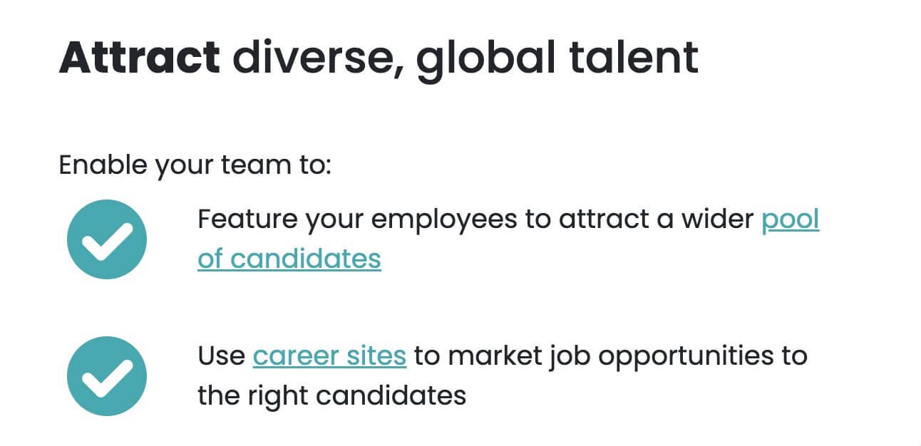
Let’s see, diversity is a thing people suddenly care about. Does ICIMS check that box?
“Use career sites.”
But is ICIMS powered by the most modern technology? Why, of course!
I have no idea what the headline means, but “applied intelligence” sounds good.
A masterclass in saying nothing. Bravo, you’re hired.
Feel Free to Use Hexagons
BambooHR has made me re-think the advice that I’ve given to clients that they should be comfortable writing longer copy. It turns out I may have been wrong about that, and you are free to invoke your 3-day Money Back Guarantee (tm).
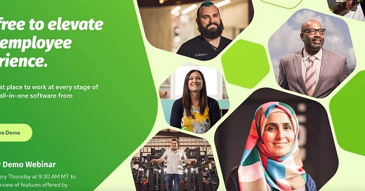
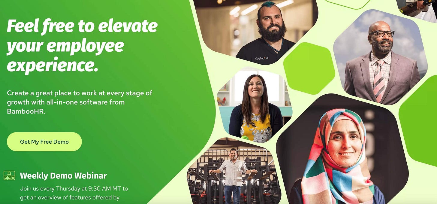
I’m the last person on earth to be giving design advice, but apparently every other person on earth wasn’t available to provide feedback when they created this visual gobbledy:
I would’ve guessed they were selling “diverse stock photography,” but alas they are not. Also, as if there wasn’t enough visual interest already, the “Weekly Demo Webinar” is actually rotating content, just to make sure your eye has no idea where to look.
I like the soft sell as much as the next guy, but “Feel free to elevate your employee experience” seems like it should be followed by, “Or don’t…we don’t give a shit.”
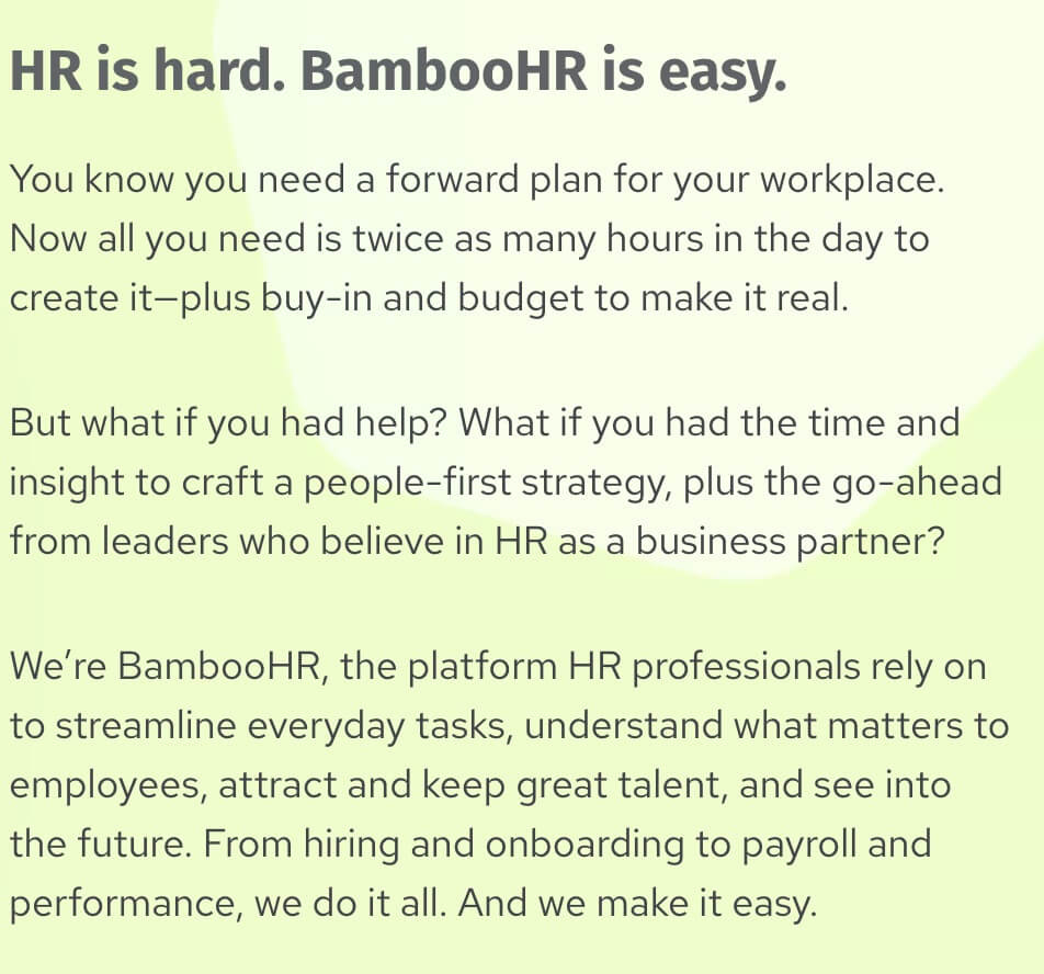
In any case, after the light-text-on-dark-background + rotating content + 5 1/2 photos + hexagons, they then have large blocks of text, which I assume were written by someone getting paid by the word, with no bonus for actually saying anything:
Bonus points for “buy-in” “people-first” and “go-ahead.” They must’ve stockpiled the hyphens during the pandemic.
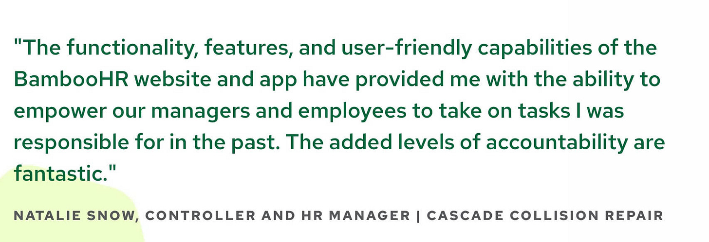
Here’s a tiny proposal: can we write testimonial quotes that actually sorta a little sound like a human non-robot might have actually said it?
Natalie, you deserve better.
This next paragraph hits a few of my favorite things…it’s got a bunch of gobbledy, coupled with not 1, not 2, but 3 rule-of-three lists:
(As I’m proofreading that, the phrase “grow your people” sounds really weird.)
The site goes on like that for a while, but I’ll spare you. Because I’ve created a culture where readers feel valued and supported, even though that required a deep understanding of how you feel, what you want, and where you need help.
23% More Something
Admittedly, it’s more fun to dunk on websites than it is to praise them (honesty is the best policy), but as I was researching the column I came across Breezy’s website, and I thought they did a really good job. No, seriously. I’m not saying that only to turn around and crap all over it. As one of my children says, “actually!”
Here’s the top slot on their homepage:
Yes, I do read “Find & Hire Employees” as “Fire Employees” when I read that quickly, but maybe that’s a good subliminal message given how things are these days.
I like that that they’re clear about their differentiator - speed. It’s mentioned in the headline (“Sooner”) and in the subhead “in less time.” I think they should stick a stake in the ground and say “23% sooner.” Hire a research agency (or a guy who writes a marketing newsletter who has a research and marketing background) to do the study, then use the actual percentage of time savings. Because if you’re faster, you’re some amount faster and you should say it over and over. And if you’re not faster, you should come up with something else. (“What would your HR team do with 23% more minutes in the day?”).**
** I’m not a math guy, but now that I think of it if your process took 23% less time, it wouldn’t mean you have 23% more minutes in the day. But shhhhhhh, don’t tell anyone.
Much of the rest of the homepage gives examples (though maybe not explicitly enough) of how the tool saves time. I like “with a single click” quite a bit, though I think this should be a top level message. “Find & Hire Employees with a Single Click” is more powerful than “Find & Hire Employees Sooner.”
Always be specific. Also, always be closing (though that’s for a different reason). But also always be specific. Specific is always better.
How Fun!
I’m not sure what to make of this, but for whatever reason many of the HR platforms mention that using the platforms can be “fun.” To wit:
Greenhouse: “We make the hiring process organized and seamless for everyone involved (and even a little fun)…”
BambooHR: “Who knew payday could be fun for everyone?”
Breezy: “Make it fun and easy for job candidates to apply and interview…”
HiBob: “Let’s delve deeper into why modern HR platforms should be functional, flexible and fun…”
Gusto: “The people at Gusto are so helpful, and the software is just so easy and even fun to use…”
I find this odd. Is the idea that HR is in charge of making the workplace fun for people and so their payroll (?) software should also be fun to use? But why should the software be fun? And how would it be fun? And if it were fun, wouldn’t non-HR people be clamoring to use it?
And why does it give me a very slightly icky “chess for girls” feeling? Am I reading too much into it?
And Here’s an Offer…
My company, Sagelett Digital, offers a 10 Week Gobbledy Transformation Program where we eliminate all the nonsense copy from your marketing, which will help you close deals faster.
Now, we’re offering our Gobbledy Website Assessment where we’ll do a deep-dive into your site (like you just read, only wayyyyyy more of it. And possibly even funnier! Or less funny!) and provide thorough recommendations on how to bring more clarity to your messaging (and if you want help creating that messaging, we offer that, too).
Sound good? Let’s chat for a few minutes about our Assessment. Schedule a 30 minute call here. I promise, I’m nice.
As I mentioned at the top we saw a really great spike in readership last week, all because you shared the newsletter. Keep up the good work :)






First, you're welcome.
Second, if I use pentagrams or squares, does that make my site less gobbledy-y?
hilarious as always. how about I pay you to roast our competitor's website, as, like.. a morale booster for our overworked, under-appreciated marketing team? Orrrr is that in bad taste? 😬