Wow, Customer Data Platforms, You’ve Sure Come Up with a Unique Way to Visualize What You Do
The 8-headed Gobbledy of the Octopus Graphic
We called it The Octopus.
A bunch of years ago I was working at a software company and we were talking about what graphic we could create for our homepage that would succinctly show what we do and how we’re different.
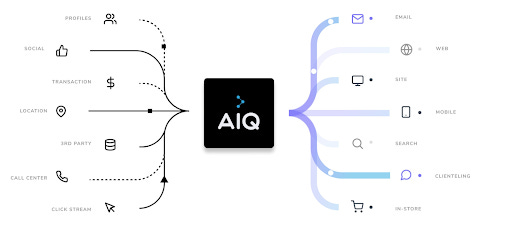
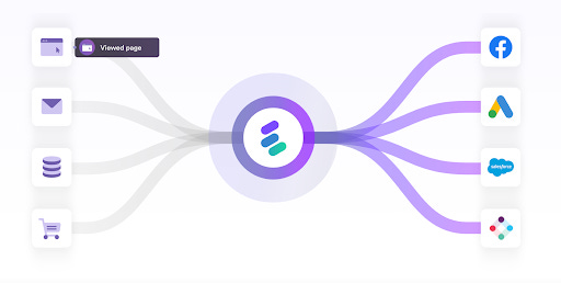
So we drew a bunch of boxes on the left that represented stuff going into our system, then drew squiggly lines connecting it to the our product, located in the middle. And on the right were a bunch of squiggly lines connected to boxes showing how stuff came out of our product and connected to other places.
And so The Octopus was born.
I’m not going to pretend we invented that. But we did stick it on our site and in our presentations and that, as they say, was that.
But as I’ve been doing research on Customer Data Platform messaging and positioning, I’ve noticed that The Octopus was everywhere.
Here’s Action IQ’s Octopus:

And here’s Amperity’s Octopus:
And Blueshift’s Octopus:
And BlueVenn’s Octopus:
And Lytics’ Octopus:
Let’s see Segment’s Octopus:
And Tealium’s Octopus:
And, befitting an octopus, the 8th octopus from Treasure Data:

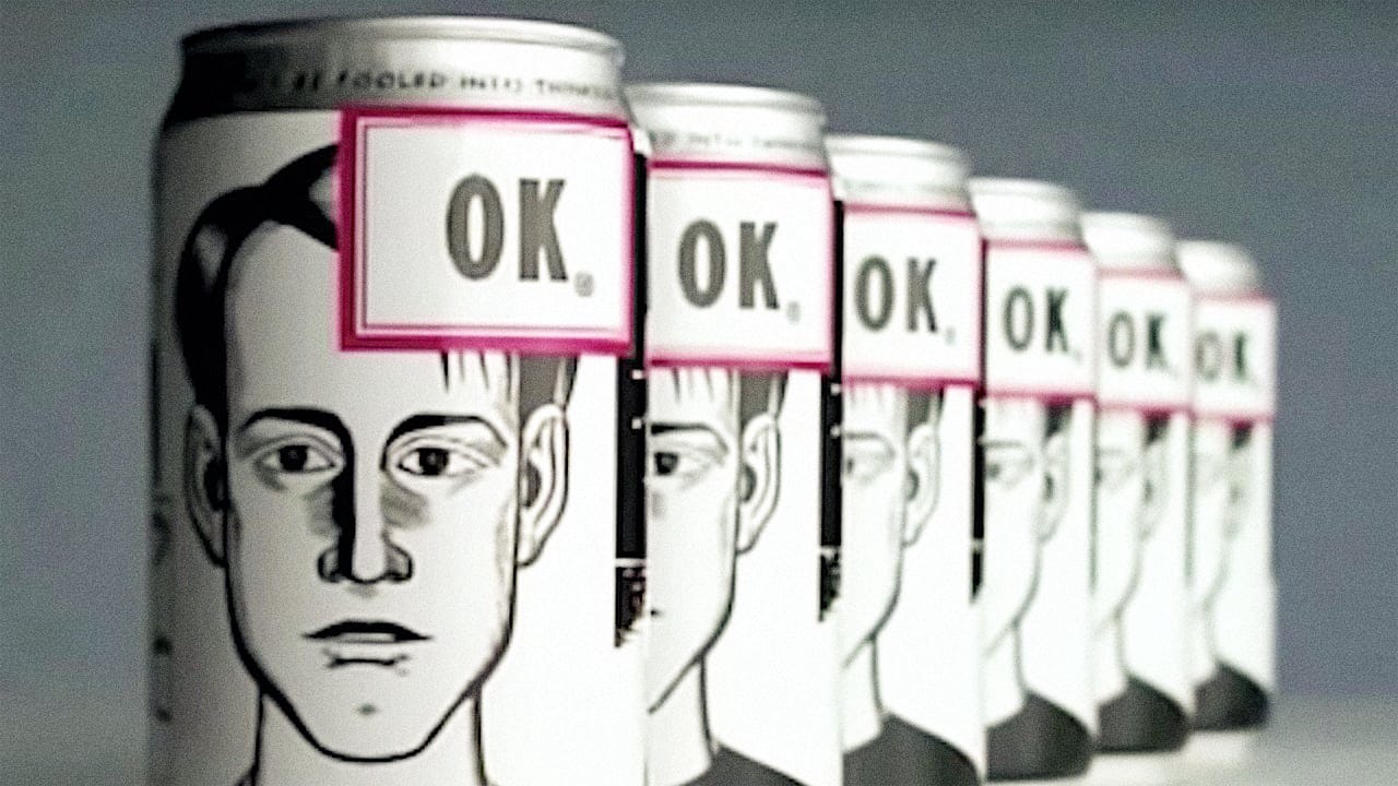
Your homepage is your most valuable marketing resource. Yet software companies treat it completely defensively — they make sure that every single base is covered, without giving any indication of how they differ from any of the other — very similar — products out there. It’s such a huuuuuuge miss. It’s like if the label of every can of soda just said “we’re soda that thirsty people drink so they won’t be thirsty anymore.”
I’m (non-clinically) obsessed with getting software companies to differentiate their products. My email is in the right column if you want to chat about it.


