
Sometimes Doing Almost Nothing Is the Most You Can Do (Logo Edition)
And an ice cream in the hand is worth...

Hello Gobbledeers,
How’s it going? This week we’re going to chat about:
Walmart’s brand refresh
Hand models
Walmart’s brand refresh press release
Yes, a rare double Walmart.
Speaking of double Walmart - if you want your messaging to help your revenue grow to be double the size of Walmart’s messaging (?), I help software companies transform their messaging. Let’s chat about that - I’m at jared@sagelett.com.
And a friendly reminder - sharing Gobbledy with others helps keep the lights on here. Since this is a free publication, I don’t really know how that works, but trust me, it does. Share this with a friend. Or if you hate it, share it with an enemy. Win/win!
The Walmartization of Walmart’s Branding
Let’s just get this out of the way:
I could talk about logos and brand refreshes all day. If someone is hiring for a Senior VP of Talking about Logos and Brand Refreshes (All Day), please reach out.
Logos and brand refreshes are the sports talk radio of marketing - everyone has an opinion and there’s no way to prove anyone right or wrong.
It seems like just last month (because it was!) that we were talking about Jaguar’s brand refresh and how everyone (“everyone”) hated it, and everyone (“everyone”) hated it so much that I am 1 billion percent certain that you had forgotten about it until I just brought it up.
When we talked about this topic last month, my advice basically boiled down to two things:
If you run marketing and decide to undertake a brand refresh project, I hope your spouse has health insurance because you’ll need it in 4 months.
If you are a decent-sized company, people will tweet about how much they hate your re-brand and that tweet will travel through the media food chain and then actual media publications will write articles with the headline, “[Your Company] changed their logo and the Internet has thoughts” or “[Your Company] changed their logo and the Internet has completely lost their shit” when, in fact, 2 people tweeted.
The size of your company is inversely proportional to the amount you can safely change your logo & branding.
Because we are all marketing folks and have limited math skills (that’s a joke! settle down! also it’s more of a fact than a joke), if you work for a big company you can safely change your branding a little bit, and if you work for a small company you can change the name of your company from textualai.ai to Bluebird.ai and nobody will bat an eye.*
(*Except the person you work for, who will have some reason why a bluebird does not represent your brand. “It’s kind of a low-flying bird, and we’re a high-flying company, y’know?”)
Anyway, that’s the cycle of brand refreshes — Refresh happens → Tweeting occurs → Media foodchain → “Internet has thoughts,” → Backlash.**
(**Also the worst Goose setlist ever.)
This week saw the latest version of this cycle of sadness when Walmart announced that they are rolling out a refresh of their brand. Here are the two primary changes (old version on left, new version on right):

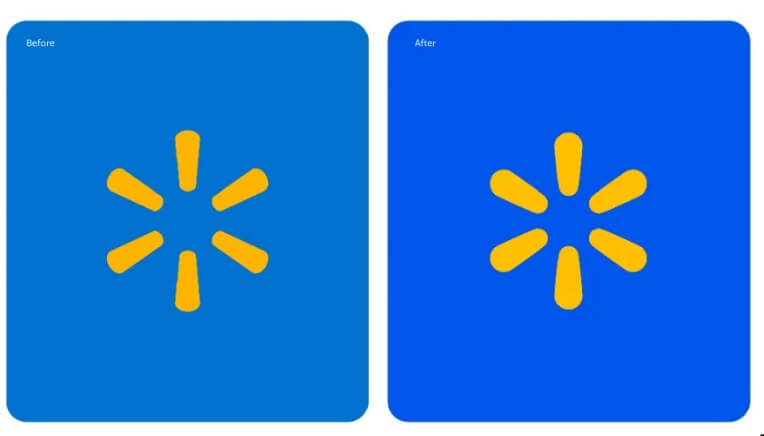
You’ll take note that they have done 3 things:
They changed the font and made it a bit more bolded.
They slightly rounded the edges in the logo and made the elements a bit more bolded.
They updated the blue from “blue” to “a different blue.”
So, let’s go to the “Internet has thoughts” part of the cycle. To wit…actual headlines:
“Walmart gets a new logo and people are talking” (I just have to say - this is an amazing headline. It can literally be used for anything. “I ate a muffin and people are talking.” Well, I guess it could also be “I ate a muffin and nobody even noticed until now.” But virtually every event in human history could use that, “Japan bombs Pearl Harbor and people cannot stop talking about it.”)
Walmart’s New Logo Is Making The Internet Mad - In all of these types of headlines the Internet is very, very sensitive. Nothing doesn’t deeply affect the Internet. You will never read “McDonald’s changes their cheese supplier and the Internet finds the hamburgers equally palatable.”
Walmart unveils 'modern' new logo. The internet can’t see the difference - An intriguing twist! In this case the Internet is mad that they were told the logos were different, but they don’t think they’re very different at all!
Walmart faces widespread mockery over ‘new’ logo - The Internet scoffs at the very IDEA that this is a so-called “new” logo. I mean, that’s what Big Logo wants you to think.
Everyone's saying the same thing about Walmart's new logo: 'I can't believe someone got paid for this' - It’s Walmart, so I’m sure they got paid very little, don’t worry Internet.
Walmart’s ‘New’ Logo Made the Internet Furious - I’m intrigued by “furious.” Here are some other recent headlines like this:
"The Internet is Furious at The Idea of Elon Musk Buying TikTok”
”The Internet Is FURIOUS That This Awful Trend Might Make a Comeback”
”'So LAZY this year': The internet is furious that Spotify Wrapped embraced AI—and got boring”
”RIP Cartoon Network Website: Warner Bros. Discovery Redirects Users To Max & The Internet Is Furious”
And my favorite: “Vikrant Massey says India got ‘so called azaadi in 1947’ and the internet is furious: 'Naye itihaskaar'“
Naye itihaskaar, indeed.
So that’s the normal “what The Internet thinks” portion of the refresh.
But it’s worth looking at the actual work.
In our seminal piece from last month about rebranding, I noted that if you are playing it safe, you can always go from a serif to a sans-serif font. Or you can “keep what you got, but make the weight of the font lighter.”
I was close!
You can play it even safer by introducing a new font but not adding serifs and making the font bolder (I had only considered making the font lighter! I was close!).
Let’s pretend, shall we, that [somehow] you are Walmart’s Chief Marketing Officer. Congrats! You got a great raise. And you can buy a brand new 4,500 square foot house in Bentonville for about $1 million. Living the dream.
You work for Walmart, the largest (by revenue) company in the United States, with more than 10,000 stores and more than a million and a half employees in the US.
Your branding hasn’t been touched in 20 years.
What do you do?
Nothing! Why in God’s name would you do something?
Blow the whole thing up and make the logo red and get rid of the yellow thingy and write Walmart in script.
Slightly change what you’ve got.
Well, 1 is a very reasonable answer, and nobody is ever fired for choosing 1.
Except that Walmart really has changed over the years, and it has become a far more digital company than anyone would’ve ever guessed 10 years ago, so at some point you’ll want to do something to suggest that this isn’t your grandfather’s Walmart (while also ensuring that your grandfather still thinks that it is his Walmart.)
Nobody is saying (except The Internet, if asked) that Walmart is in any sort of trouble. It’s a highly profitable company that, despite doing more than $600 billion (billion!) in revenue, somehow continues to grow. It doesn’t need to be blown up (like, say, Macy’s).
So what option do you have? You have option 3, and that’s exactly what they did.
I think we sometimes forget - doing the absolute least you can do, while still doing something, is often the best option.
(Thanks to Gobbledy reader L.R. for inspiring all that.)
Now I Understand Hand Models
A little Peppermint Stick-flavored palate cleanser before we go back to Walmart…
Ad Age has a pretty interesting article about dying (or dead) restaurant brands being revived this year and talked about comebacks by Ground Round (a family favorite of ours in the 1980s), Steak & Ale, Chi Chi’s, Roy Rogers and others.
One of the chains they discuss was ice cream shop Friendly’s, which was also a family favorite of ours. I didn’t realize it had been shrinking - it has 99 locations compared to 800+ 30 years ago. I went to their website to see if the one in my hometown was still there (it is), and came across this image, which struck me:
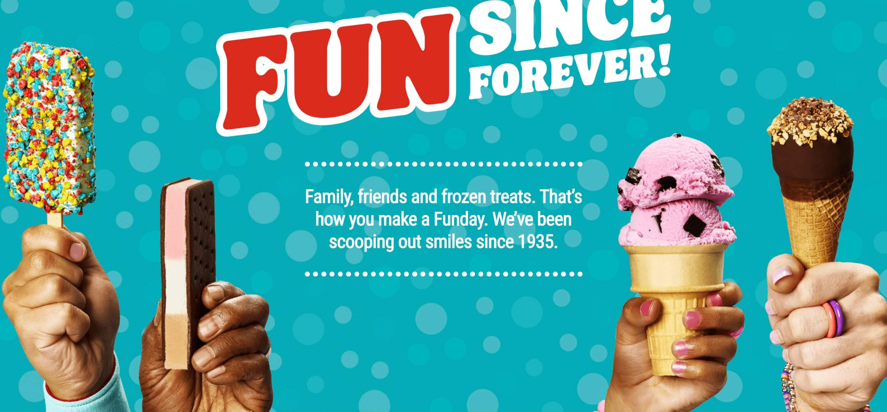
Now, I only am aware of 2 hand models - George Costanza and his Ray McKigney ("None could match the beauty of his own hand") so I’m hardly an expert here.
But I can’t decide if my issue here is that these are not the hands of professional hand models, or if the art direction is just a disaster. Why does the hand on the right have the rings on? And the bracelet sort of visible in the back? And what’s up with the manicure on the hand holding the raspberry chip? And the hand with the ice cream sandwich is kinda wrinkly?
I’m not saying this is easy, but take a look at this photo from Van Leeuwen ice cream:

Clean, no? It’s not all folds and knuckles. Doesn’t distract from the ice cream.
I have zero art direction skills (as if that’s going to stop me from criticizing it!), but if you’re going to create corporate imagery, even on the cheap, have some pride!
(I take all of this back if this is the result of Friendly’s “win a chance to have your gross hand in our advertisement” contest).
Back to Walmart….
My Actual Favorite Part of the Walmart Logo Story
The worst part of when a larger company refreshes their logo and branding is that someone on the corporate communications team has to write a press release explaining the changes.
Despite you not asking, here is Walmart’s press release on the branding changes.
You can’t just say, “y’know how 20 years ago you painted your guest bathroom and you loved the color and it looked great but it’s been 20 years and it’s sort of just time to re-paint the guest bathroom a slightly different shade of gray and maybe we’ll get new towels? Well, this rebrand is just that.”
No, you have to come up with some reason why the slightly different shade of blue better represents the company that you are today:
“This update, rooted in the legacy of our founder, Sam Walton, demonstrates our evolving capabilities and longstanding commitment to serve our customers of today and tomorrow…”
“Our Walmart will always be their Walmart, and our brand will always be a testament to how we innovate and change alongside them. The updated brand identity will help Walmart build credibility and connection…”
Et cetera.
Of all the awesome corporate speak I’ve read over the years, “Our Walmart will always be their Walmart” goes into the recently renovated Gobbledy Hall of Fame (tm). Congratulations.
I actually had another logo story ready to go, but we’ll save that for next week (which, depending on what you thought about this week’s newsletter is either a promise or a threat. Answer: it’s both).
As always, thanks for reading to the end. If you’re new to Gobbledy, welcome! I'm always happy to just chat with readers (or people who pretend they read this). You can set up half an hour at my Calendly link. There’s no pitch - I just like to talk about marketing.
I think one of the main issues with the Friendly's hand photo is that all the hands seem to be holding the ice cream in the most anxiety-inducing awkward death grip possible.
Like, I would challenge anyone to take an ice cream cone and try holding by the very tip in a tightly clenched fist like the hand on the far right is doing. I bet if you do so, you'll think to yourself, "Huh, I have NEVER held an ice cream cone like this in my life."
Who knew hand modeling was a real thing? Every week a new rabbit hole to go down. Addictive.